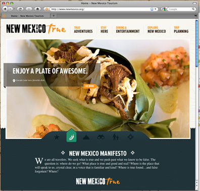
The latest round of commercials from the Department of Tourism has been out for a couple of weeks. What are we to make of the results?The ads were controversial from the word go, with the department hiring companies from out of state to create them. The creators put out a casting call for "light-skinned Hispanics.” The campaign was designed to beat back perceptions of us that had come to the department’s attention via a focus group. Descriptions like "barren” or “dull” or “close to Arizona” sent everyone into a lather. But do the commercials—and the new buzzword "true" repeated throughout—counter that? Not from where I’m standing. Not even close. It’s worth parsing the campaign’s individual pieces, and we’ll get there, but here’s the deal for me: After numerous views, a fundamental visual flaw emerges: The commercials look too good, so they spin in counter rotation to the overall theme of "authenticity." In a time when self-made media dominates the Internet, the ads come off as extraordinarily untrue. Perfectly framed, shot with precision, marvelously lit, choreographed actors moving in harmony—the ads scream their technical virtuosity. “New Mexico True” is a solid effort—but a dated one. It’s out of step with the target demographic of tech-savvy travelers who are scanning newmexico.org before making vacay plans. Worse, the ads confirm the dismissal of our creative industry. The department didn’t have to go elsewhere. I see nothing in the ads or on the website that is out of our state’s reach, production-wise. Try this test. When you watch the clips, imagine the actors kayaking, hiking, sitting in restaurants, running with their arms spread, etc., just in a different state. It’s not that hard to picture because this is a by-the-book set of familiar scenes not all that different from the target road-trip markets of Colorado, Texas and Arizona. If New Mexico looks just like home, why take the trip? And this is supposed to attract, according to Tourism Secretary Monique Jacobson, "adventurous spirits" with a "thirst for authenticity." Seriously? Viewers will pick up on the fact that not a soul on camera is even close to breaking a sweat while adventuring. They look exactly like what they are: paid performers "acting" as if they are on a field trip. They just have to jitterbug to and fro until someone yells cut. And then do it again. This is not authentic. Neither is the apparent lack of anyone terribly dark in complexion. And do we see any acknowledgment of a gay or lesbian couple in these ads? Nope.Last I checked, adventurous young travelers respond to diversity when on vacation. By not including more hues of our rainbow, the ads spin yet again against their own theme of realness.OK, so what is authentic? How about someone looking at us (via their cell phone video camera), out of breath, a vista over their shoulder, telling us what just transpired on the journey, what it meant and, by subtext, why your life might be altered as well if you did the same? That’s credible today. Scores of video testimonials and self-shot footage would mean something. And this "New Mexico Manifesto" front-and-center on the tourism website—what are we saying here? "Where is the place that will speak to us, crystal clear, in a voice that is familiar and kind? Where is true found and false forgotten? Where?”A narrator recites this buzzkill on the commercials, too. Who, exactly, is this voice? Is he some sort of official state philosopher? This approach is not culturally credible because this manifesto is a contrivance—and a bad one at that. The campaign also doesn’t integrate smartphone tech. There’s nothing to scan or download, and nary a single tourism-related app, hashtag or QR code in sight. Just the standard outlets of Facebook, Twitter, YouTube and (a beacon in the fog) Pinterest. All sunk like rocks to the bottom of the page. At the time of this writing, almost two weeks following the campaign’s unveiling, cultural misses and a sloppy approach are still all over it like bird droppings.Under " Culinary," you’ll find an entire list of wine festivals for the year that’s simply copied-and-pasted text with dead links to the events. Under " Farmers’ Markets" there’s one listing in Las Cruces. Under " Trip Planning," there is one guidebook listed. One. Dear Madam Secretary, I have bad news. Your website is boring. It enhances the very perception you charged these out-of-state ad-makers with fixing. Finally, it’s crushing to consider that we may have just missed a brilliant opportunity to get a nose out in front of our neighbor states with bigger budgets. We could have hooked the entire campaign on real people and social media tools. My sense is the focus group took the Tourism Department on the wrong, panicked path and, so too, the ad agency. Branding anything "authentic" or "true" is tricky business. You need a home run with that aggressive a swing. We didn’t get that. The lesson? A lofty premise will be proven right or wrong by the experts—real people.
Gene Grant is host of "New Mexico in Focus" on KNME. Of his many oddball interests, considering why state and city branding efforts usually fail has been taking up a lot of his time.
The opinions expressed are solely those of the author.
