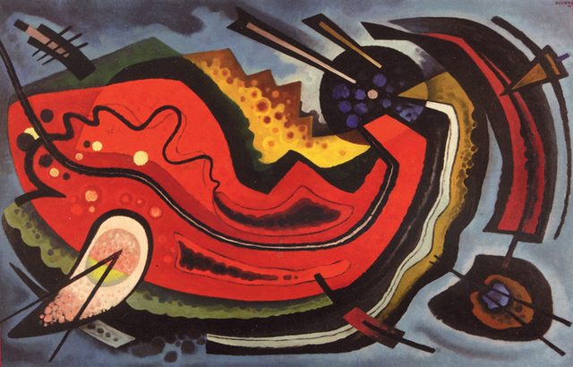
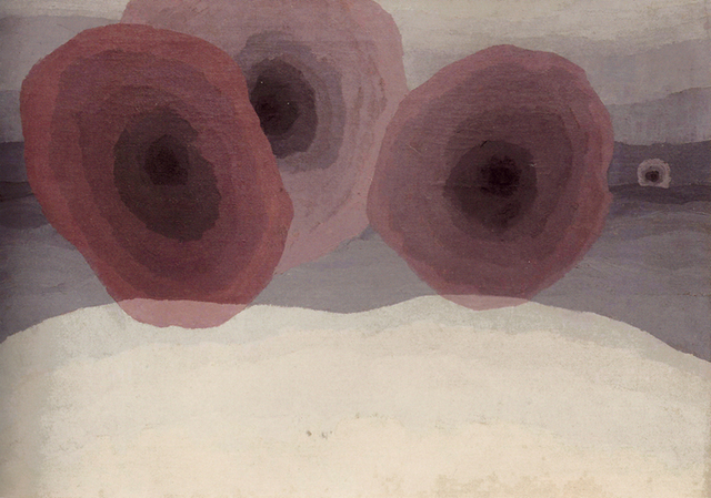
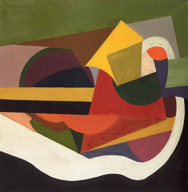
As far as cognitive peculiarities go, synesthesia seems pretty sweet. Instead of just hearing sounds, the brain translates the aural with another sense function, say vision or taste. What is for one person an F sharp can, for the synesthete, be a green- or raspberry-hued note.Scientists have a hard time putting numbers on how many people are affected by synesthesia because many who have it don’t realize it’s any different from how anyone else sees the world. Of course, there are also varying degrees, so while one person might be flooded with a wash of color every time he reads a book, another might only get a faint whiff of chocolate cake when hearing a jazz quartet.These types of perceptual differences are the subject of the Albuquerque Museum of Art and History’s exhibition Sensory Crossovers: Synesthesia in American Art . Though the works are largely confined to walls, the artists’ secondary sensory experiences bring a multidisciplinary feel to much of the art on display.For the critic, a show such as Synesthesia creates a problem. The collection is meant to be viewed without a focus on the intellect as much as an attention to feeling and reaction. Possibly the most fascinating part of this experiential viewing was finding myself in disagreement with the artists’ vision of the world. In her works “Lil Hardin and Louis Armstrong” and “Toscanini at NBC,” Theresa Bernstein’s use of muted, earthy colors looked like I think the music of these artists would. But “Charlie Parker” caused me to recoil. Green?! Charlie Parker does not sound green. Ever. Maybe, every once in a great while a dark, brownish yellow.It seems ridiculous, in retrospect, to so adamantly disagree with an artist’s choice of colors based on a purely gut feeling, but that experience came through again and again throughout Synesthesia . Emil Bisttram’s “Musical Notes” made me so hungry upon walking in the gallery that I avoided it until the end—then hit up Little Red Hamburger Hut on Mountain on the way back Downtown because I thought I was dying, even though I’d just eaten. Seriously, I blame that whole adventure on Bisttram, whose work I normally glance at and think nothing of. Oddly, it wasn’t this work’s bright-red, fish-shaped object as focal point and tiny chopstick and sushi-like satellites that made me hungry (I didn’t even notice the shapes until later)—it was the sheen of the oil paints. Something about the glossy red, green and yellow made me crave a burger. I noticed the shape later and actually wished I were craving sushi, as I like it better than beef.Was this all an acquired synesthetic experience, a psychosomatic adoption of a neurological condition I’ve actually said I wish I had? Maybe. Or perhaps some of the artists in the show are simply so effective at sharing their way of seeing the world, it rubs off a bit. Arthur Garfield Dove’s “Fog Horns” looks like fog horns might sound; but whether that comes across to every viewer before he or she sees the title is impossible to know. Charles E. Burchfield’s watercolor and ink on paper “Telegraph Music” vibrates with a sense of sound and uses the wavy lines we’ve been exposed to in sound drawings since childhood.The literal works in Synesthesia often come across as an artist’s example of what they think synesthesia would look like, whereas several of the more abstract ones, such as Ira Jean Belmont’s “A Color-Music Expression of an Excerpt from Richard Wagner’s ‘Prelude to Lohengrin’ ” or e.e. cummings’ “Sound,” appear to be more genuine expressions of experience. cummings’ painting, in particular, looks like one of his poems, clearly defined forms and relationships but without the need to adhere to obvious structure.An eight-piece series titled “Symphony #2” by Horace T. Pierce is astounding in its form due mostly to the adoption of his vision of music into contemporary conceptions. The watercolor and airbrush on paper works are geometric expressions of music that look like the still frames of music visualization software, though Pierce’s work uses a less neon or psychedelic color scheme. “Symphony #2” was painted between 1949 and 1952 but takes a familiar shape. It makes me wonder if synesthetic experiences are not only similar to one another but can be understood by those who aren’t affected by them directly.The show, which moves to the Burchfield Penney Art Center in Buffalo, N.Y., after its four-month run in Albuquerque, features a strong collection that reaches beyond the visual to speak to its audience. A cell phone tour accompanies several of the works, though it can be a touch didactic, steering viewers to a certain experience, rather than allowing them to simply have it.
Sensory Crossovers: Synesthesia in American Art
Runs through Jan. 2, 2011 Albuquerque Museum of Art and History2000 Mountain NWcabq.gov/museum
